Pictures taken by me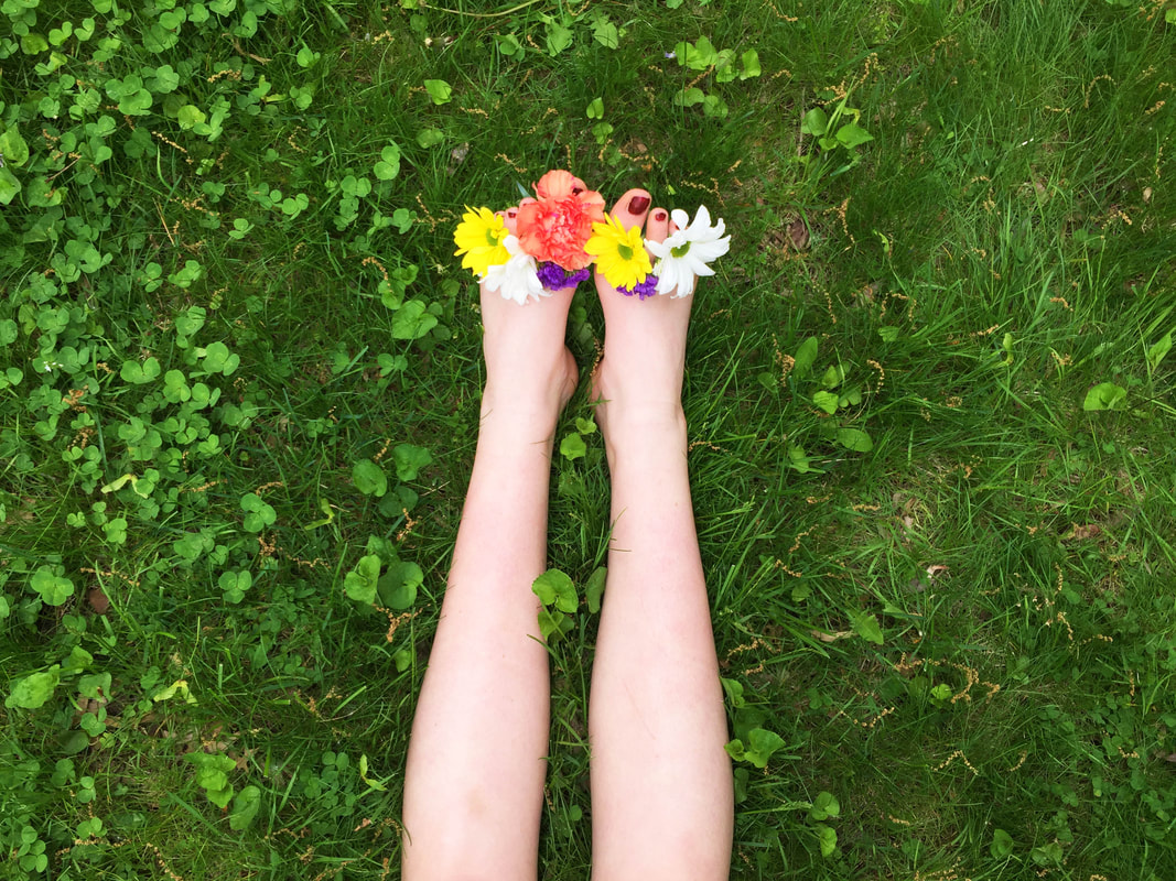
Flowers Feet |
Pictures taken by Emily Blincoe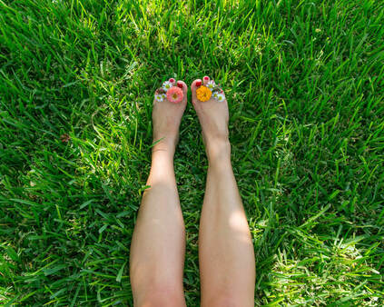
Personal Growth |
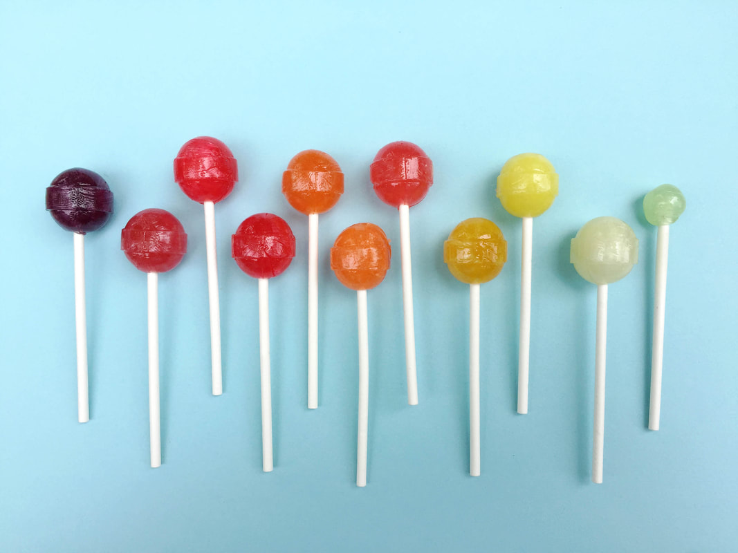
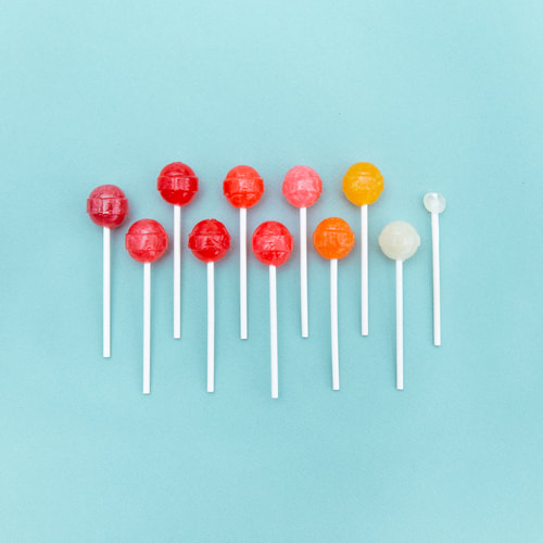
Suckers |
A Bank Robbery from Arrangements Series |
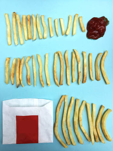
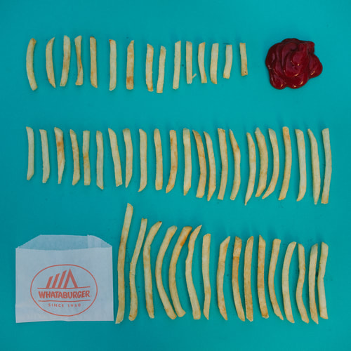
Fries, Fries, Fries |
Arrangements |
Compare and Contrast |
Artist Statement |
|
When I saw Emily Blincoe’s pictures, I thought remaking her pictures would be fairly easy. It turns out to be the opposite. The first picture that I took was the fries. I set two colored papers as the background so there’s less space to arrange the fries than the original picture that’s why they look really tight together. The second picture that I took was the suckers. Some of them have different colors than the original just because that’s what I got from the store. Also the picture looks more zoomed in than the original picture because of the limited space. The last picture that I took was the flower feet. I took the picture just a few minutes before it started raining in the afternoon that’s why there’s no sunshines on the grass like it is on the original picture.
|
I took these pictures in my backyard on Memorial Day Weekend. I was lucky because I got to take my pictures just before it started raining and it keeps raining the whole weekend. I’m really happy that I got the chance to remake three of my favorite pictures by Emily Blincoe, even though my pictures are nothing compared to her original pictures. I tried to take the pictures from different viewpoints, and taking pictures from above works best for this project. I usually use rule of thirds when I take pictures and make it symmetrical and balance. But this project is a little bit different. I need to be more flexible and use more imagination. On the fries and the suckers pictures, we can see a pattern there, and I think that’s the point of Emily Blincoe’s arrangement series.
|
